Gaming News
All our coverage of the latest video games, consoles and accessories.

Garry’s Mod faces deluge of Nintendo-related DMCA takedown notices
Facepunch Studios has announced on Steam that it's removing 20 years' worth of Nintendo-related workshop items for its sandbox game Garry's Mod to comply with the Japanese company's demands. But fans say the takedown notices came from trolls, not from Nintendo itself.

PUBG will take a nostalgia-infused trip back to its first map in May
PUBG: Battlegrounds is somehow old enough to evoke nostalgia. The pioneering battle royale game will recreate the old-school battlefield from the game’s inception for a limited two-week run in May and June.

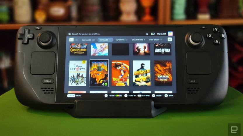
Steam closes an early-access loophole in its refund policy
Valve has closed a loophole in its refund policy that let users play many hours of a game before its official release and still get their money back.


Your old Rock Band guitars now work in Fortnite Festival
Fortnite's Rock Band-style Festival mode now supports Rock Band 4 guitars. Meanwhile, Billie Eilish has joined the game as its latest music icon.
Best Gaming Hardware

The best PS5 games for 2024: Top PlayStation titles to play right now
Here are the best games you can get for the PlayStation 5 right now, as chosen by Engadget editors.


The 5 best mechanical keyboards for 2024
Here's everything you need to know before buying a mechanical keyboard, plus the best mechanical keyboards you can get right now.


The best SSDs for PS5 in 2024
If you need more space to store games on your PS5, these are the best drives you can get.
The best gaming laptops for 2024
There's never been a better time to buy a gaming laptop. These are our top picks that we've tested and reviewed that will fit all kinds of use cases and budgets.

Latest
Garry’s Mod faces deluge of Nintendo-related DMCA takedown notices
Facepunch Studios has announced on Steam that it's removing 20 years' worth of Nintendo-related workshop items for its sandbox game Garry's Mod to comply with the Japanese company's demands. But fans say the takedown notices came from trolls, not from Nintendo itself.
PUBG will take a nostalgia-infused trip back to its first map in May
PUBG: Battlegrounds is somehow old enough to evoke nostalgia. The pioneering battle royale game will recreate the old-school battlefield from the game’s inception for a limited two-week run in May and June.
Steam closes an early-access loophole in its refund policy
Valve has closed a loophole in its refund policy that let users play many hours of a game before its official release and still get their money back.

Your old Rock Band guitars now work in Fortnite Festival
Fortnite's Rock Band-style Festival mode now supports Rock Band 4 guitars. Meanwhile, Billie Eilish has joined the game as its latest music icon.

Nobody needs to spend $160 on a gaming mouse, but Razer’s new Viper V3 Pro is excellent anyway
Razer has announced the Viper V3 Pro, its latest premium wireless gaming mouse. Here are our hands-on impressions.

Castlevania fan uncovers new Konami code in 1999 game
A new Konami Code has been discovered hidden inside Castlevania's code, and it changes gameplay so drastically that it aficionados will want to give it a fresh try.
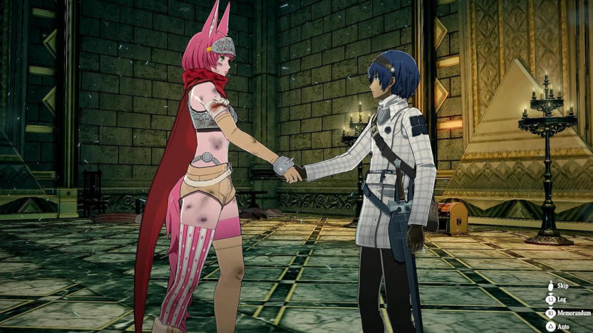
Metaphor: ReFantazio, a fantasy RPG from the Persona 5 team, comes out in October
Metaphor: ReFantazio is coming out on October 11, and you can pre-order it right now.

Even the indie game El Paso, Elsewhere is getting turned into a movie
The hit indie game El Paso, Elsewhere is getting turned into a movie, with Academy Award nominee LaKeith Stanfield attached to both star and produce. Di Bonaventura Pictures and Colin Stark will also produce.

Star Wars Jedi: Survivor is coming to Game Pass Ultimate and EA Play on April 25
Star Wars Jedi: Survivor is coming to Game Pass Ultimate, PC Game Pass and EA Play on April 25.
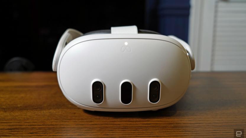
Meta opens Quest OS to third parties, including ASUS and Lenovo
In a huge move for the mixed reality industry, Meta announced today that it's opening the Quest's operating system to third-party companies, allowing them to build headsets of their own.
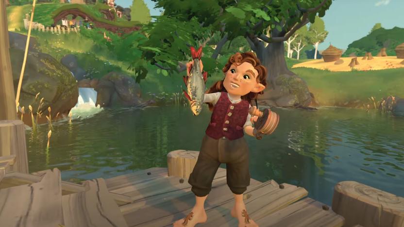
Tales of the Shire trailer shows what life as a regular Hobbit looks like
Weta Workshop and Private Division have released the first trailer for Tales of The Shire. You play as a Hobbit in this Lord of the Rings cozy life sim.

Embracer Group is splitting up its messy gaming empire into three different companies
Embracer Group has announced plans to split into three separate, publicly listed entities, following an epic losing streak.

Finally, someone used Pareto’s economic theories to find the best Mario Kart 8 racer
Who hasn’t spent sleepless nights pondering what would happen if we applied the theories of Vilfredo Pareto, the early 20th-century Italian economist, to Mario, the Mushroom Kingdom’s Italian high-jump champion and part-time elephant cosplayer? Data scientist Antoine Mayerowitz, PhD, tackled that age-old question.

Prison Architect 2 is denied release until September 3
Double Eleven and publisher Paradox Interactive have delayed Prison Architect 2 by four moths to work on technical issues.

Engadget Podcast: PlayStation 5 Pro rumors and a look back at the Playdate
This week, Engadget Senior Editor Jessica Conditt joins Cherlynn and Devindra to chat about the PS5 Pro, as well as her piece on the PlayDate two years after its release.
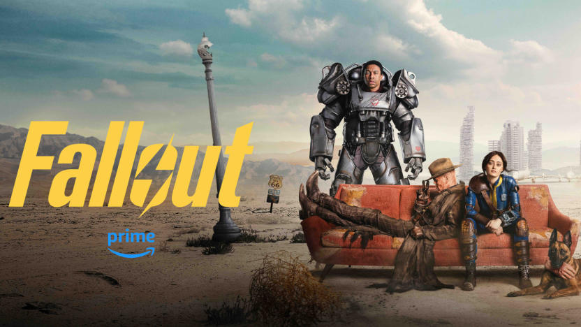
Fallout has already scored a green light for a second season
Amazon has renewed the hit show for a second season.
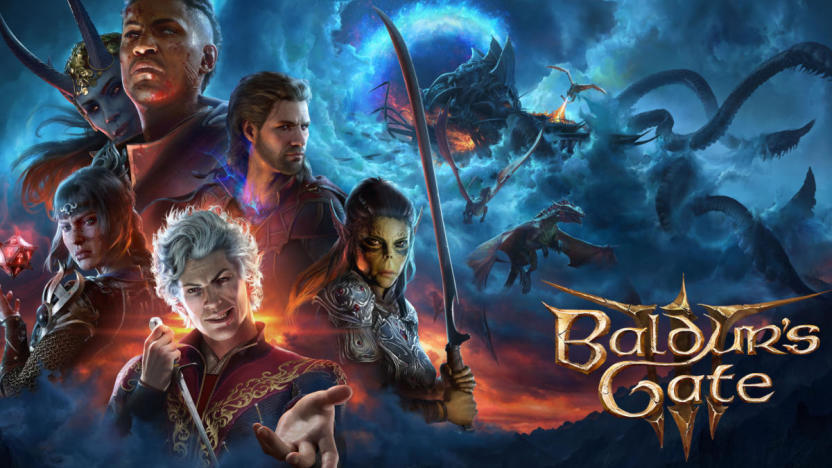
Baldur's Gate 3 developer confirms it won't make the sequel
The developer behind the popular, award-winning and slightly bawdy Baldur's Gate 3 may not be doing a sequel, but it does have other irons in the fire.

The best PS5 games for 2024: Top PlayStation titles to play right now
Here are the best games you can get for the PlayStation 5 right now, as chosen by Engadget editors.

Blizzard takes aim at Overwatch 2 console cheaters
Blizzard is targeting Overwatch 2 cheaters who use a keyboard and mouse on consoles to gain an advantage over controller users.

It took 20 years for Children of the Sun to become an overnight success
Though it feels like Children of the Sun popped into existence over the span of two months, it took Rother a lifetime to get here.


