Gaming News
All our coverage of the latest video games, consoles and accessories.

Take-Two plans to lay off 5 percent of its employees by the end of 2024
Take-Two Interactive plans to lay off 5 percent of its workforce, or about 600 employees, by the end of the year.

Take-Two plans to lay off 5 percent of its employees by the end of 2024
Take-Two Interactive plans to lay off 5 percent of its workforce, or about 600 employees, by the end of the year.
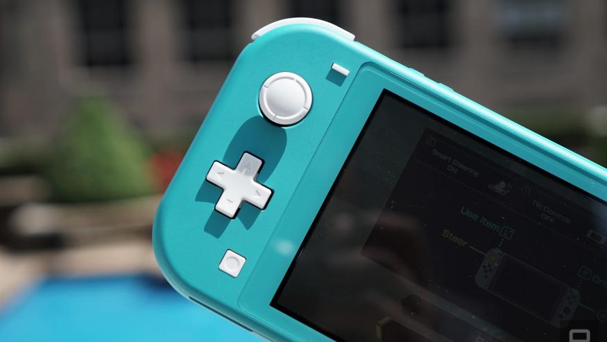
Nintendo’s next Indie World showcase is set for April 17
Nintendo has announced an Indie World showcase for April 17. Might it finally, at long last be time for Hollow Knight: Silksong news?


The best laptops for gaming and schoolwork
Here's the latest list of the most powerful and affordable laptops for gaming that students can also use for school, as reviewed by experts from Engadget.

Indie game studio Possibility Space shuts down, CEO blames leaks to reporter
Possibility Space, an independent game studio with employees distributed across the globe, was abruptly shut down today.
Best Gaming Hardware

The best gaming laptops for 2024
There's never been a better time to buy a gaming laptop. These are our top picks that we've tested and reviewed that will fit all kinds of use cases and budgets.

The best VR headsets for 2024
If you've been intrigued by virtual reality for a while, there are a number of solid headsets to consider. These are the best VR headsets we've tested and reviewed.
How to choose the best TV for gaming right now
Here's a guide to picking the best TVs for 4K gaming, plus a few of the best gaming TVs you can get right now.

The best gaming accessories on a budget for 2024
Here's a list of the best budget gaming accessories you can buy, as chosen by Engadget editors.

Latest

Take-Two plans to lay off 5 percent of its employees by the end of 2024
Take-Two Interactive plans to lay off 5 percent of its workforce, or about 600 employees, by the end of the year.

Nintendo’s next Indie World showcase is set for April 17
Nintendo has announced an Indie World showcase for April 17. Might it finally, at long last be time for Hollow Knight: Silksong news?

The best laptops for gaming and schoolwork
Here's the latest list of the most powerful and affordable laptops for gaming that students can also use for school, as reviewed by experts from Engadget.

Indie game studio Possibility Space shuts down, CEO blames leaks to reporter
Possibility Space, an independent game studio with employees distributed across the globe, was abruptly shut down today.

Avalanche Studios devs have reached a contract agreement in bid to unionize
Over 100 staffers at Avalanche Studios have successfully unionized, as they just formed a bargaining agreement with a Swedish union. The agreement goes into effect during the second quarter of 2025.

Ubisoft is deleting The Crew from players' libraries, reminding us we own nothing
Ubisoft is pulling licenses from people’s The Crew accounts, essentially taking away a game they paid real money to own. This happens after it stopped being operable on April 1.
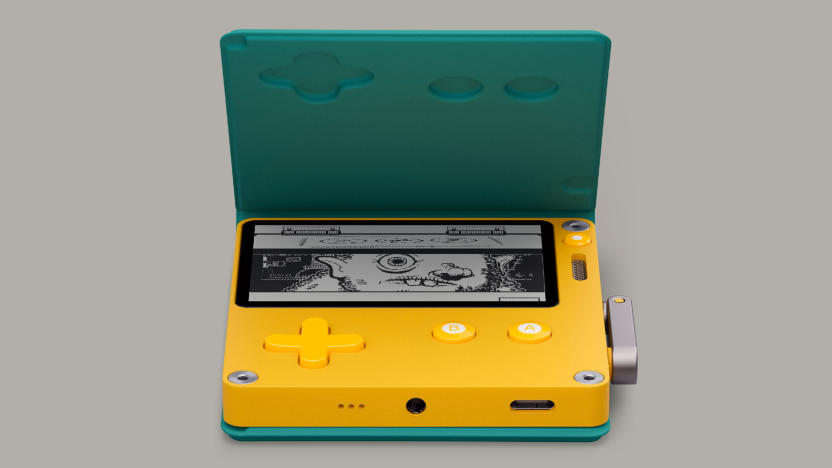
The Playdate Stereo Dock got stuck in factory limbo, but it's still coming
Panic is still working on the Stereo Dock, and the hold-up is due to unexpected issues in its factory pipeline.
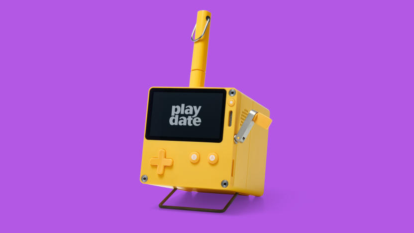
Playdate revisited: Two years with the little yellow inspiration machine
Playdate has only gotten cuter and more relevant with age.

Prime members can play Fallout 3 and New Vegas on Luna for the next six months
Fallout games are having a moment in the wake of its new TV series adaptation. Amazon has added two of the series’ best games to Luna, its cloud streaming service, and a current-gen console update is arriving for Fallout 4.
The best gaming laptops for 2024
There's never been a better time to buy a gaming laptop. These are our top picks that we've tested and reviewed that will fit all kinds of use cases and budgets.
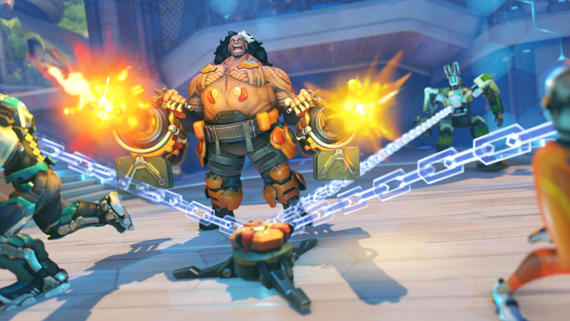
Overwatch 2 introduces harsher punishments for players who leave mid-match
Leaving 10 out of 20 competitive games will get you banned for the rest of the season.
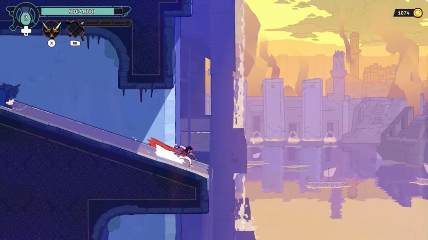
A new Prince of Persia game is coming from the studio behind Dead Cells
There’s a new Prince of Persia game coming from the studio behind Dead Cells. The Rogue Prince of Persia will be available in early access on May 14.

Palworld's upcoming Arena mode looks like Pokémon PvP with guns
Palworld is set to add a PvP Arena mode, which won't do much to help the game get rid of those pesky Pokémon comparisons.

Never Alone 2 teaser shows Nuna and Fox coming face-to-face with giant creatures
E-line Media has revealed the first teaser for Never Alone 2, a long-awaited sequel to a classic indie game.
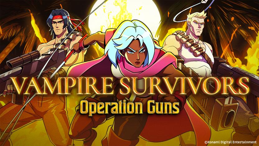
Vampire Survivors hits PlayStation this summer
Vampire Survivors is due to hit PlayStation 4 and PS5 in summer 2024. Yep, the summer that starts in just a few months.

Massively co-op game 33 Immortals will have a closed beta at the end of May
The closed beta for 33 Immortals will kick off on May 24 and run through June 2.

The EA Play subscription service is getting more expensive
EA is raising the price for its EA Play subscription service. The monthly cost is going up to $6 and the yearly price is shooting up to $40.
Sony is bringing another game to the PS Plus Catalog on its release day
Sony has revealed that three games will be hitting the PS Plus Catalog on their PlayStation release this month: Dave the Diver, Tales of Kenzera: Zau and Animal Well.
 9110091100
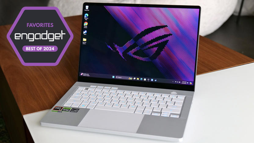
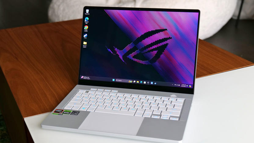
ASUS ROG Zephyrus G14 (2024) review : This is the 14-inch gaming laptop to beat
For anyone who wants strong performance in a portable design, the ASUS ROG Zephyrus G14 is both pound for pound and dollar for dollar the best choice around.

How to watch The Triple-i Initiative indie game showcase at 1PM ET
The creators of many hit indie games (including Vampire Survivors, Dead Cells and Spiritfarer) have come together to run their own showcase. You can watch The Triple-i Initiative here at 1PM ET.


